iPhone Duo API checklist: the layout code that will break
An iPhone Duo API audit list for iOS teams: what Xcode 27.1, size classes and reservedRegions replace, and how to test every fold before you ship.
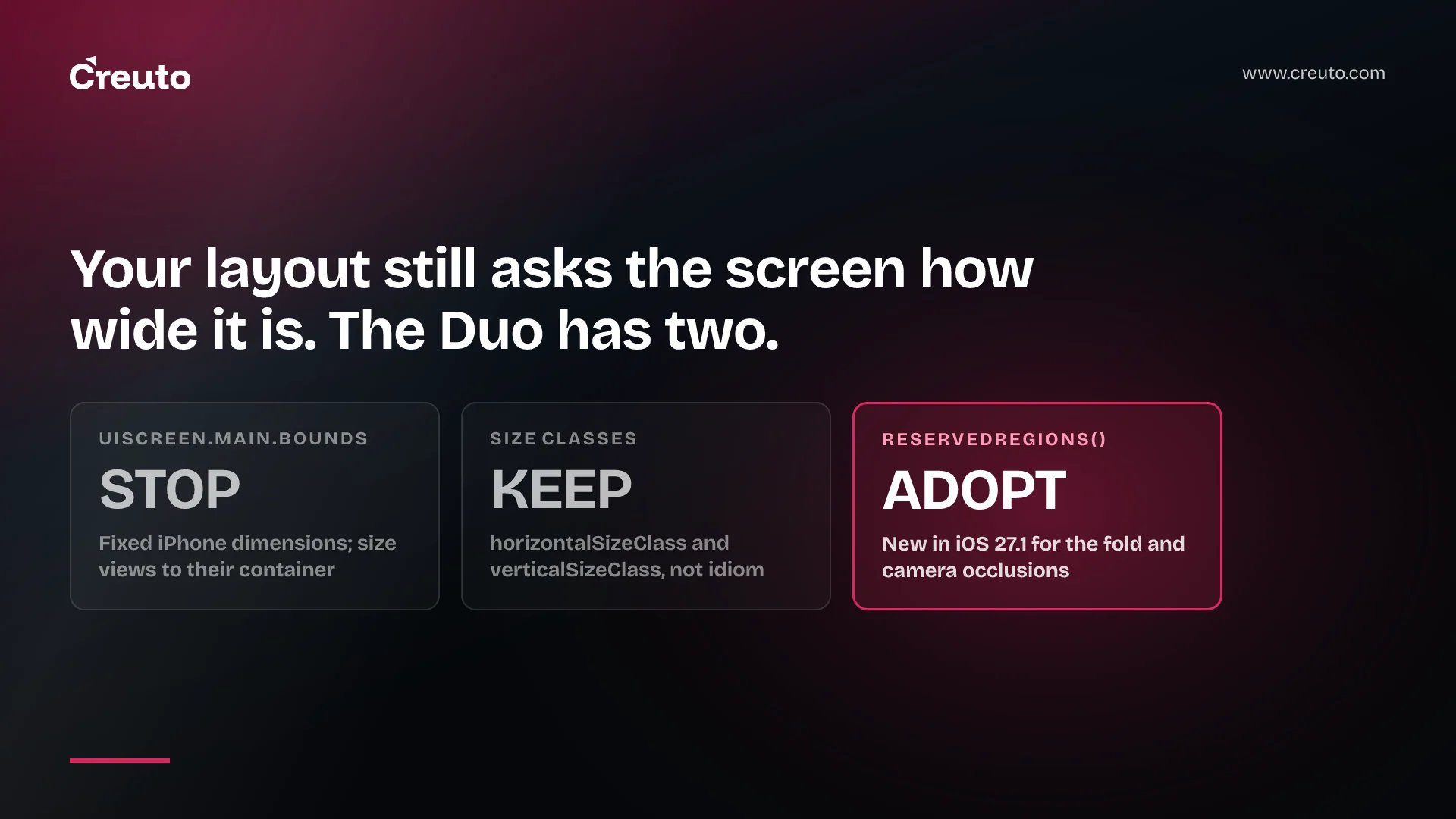
The iPhone Duo API change that will break the most code is not a new framework. It is one line you already wrote. Apple's own guidance tells iOS developers to stop making layout decisions from UIScreen.main.bounds, userInterfaceIdiom or UIInterfaceOrientation, and to rebuild with Xcode 27.1 so content extends beneath the status bar and camera. This post is the audit list: what breaks, what replaces it, and how to test it.
We have covered what actually changes about foldable iPhone app development as a product decision. This one stays at the level of the code. Every API name below was checked against Apple's developer documentation on 27 September 2026, not against the coverage.
The iPhone Duo API audit in one table
Five things in a typical iOS codebase are affected. Work down this list before you open a single design file.
| What you have | Verdict | What to use instead |
|---|---|---|
| Built with Xcode 26 or earlier | STOP | Rebuild with Xcode 27.1 |
UIScreen.main.bounds in layout maths | STOP | Scene or container bounds |
userInterfaceIdiom, UIInterfaceOrientation branches | STOP | Size classes |
Custom bars from UIToolbar, UINavigationBar, UITabBar | STOP | toolbar(content:) on a navigation container |
| Custom views drawn edge to edge | ADOPT | reservedRegions() |
Xcode 27.1 is a build requirement, not a recommendation
Apple states it plainly: when you build with Xcode 26 and earlier, your app doesn't extend under the status bar and camera. That is not a crash, which is why it will survive your release checklist. It is a visible band of unused screen on a device whose whole selling point is screen. InfoQ's write-up of the guidance names Xcode 27.1 as the version to use.
Worth knowing before you plan the sprint: Apple's own announcement on 18 September 2026 points at the Xcode 27.1 beta, and the new reserved-region APIs are marked beta for iOS 27.1 in the documentation. You are adopting against a moving target. In the mobile work we do, that argues for putting the layout fixes in first — they are the ones that hold whatever else changes — and leaving anything that depends on beta API surface until the release build.
Screen dimensions are now a lie in three different ways
iPhone Duo has an outer display and a larger inner display, and it can sit partially folded in between. Apple's instruction is to size views relative to their container and to make layout calculations based on your scene or containing view's bounds rather than screen dimensions. Anything that reads the screen once at launch and caches a width is wrong on three of the device's poses.
The replacement for idiom and orientation checks is size classes. Apple tells UIKit developers to use automatic trait tracking to observe horizontalSizeClass and verticalSizeClass changes, and not to use userInterfaceIdiom or UIInterfaceOrientation for layout decisions. The Human Interface Guidelines give the shape you are aiming at: a compact width layout for the outer display and a regular width layout for the inner display cover every pose between them. You are not writing six layouts. You are writing two and letting them stretch.
This is the same discipline Android developers were handed for large screens, and we made the same point when Android apps had to adapt for laptop-class devices. Teams that did the resizing work then are mostly fine now.
Adapt custom toolbars for iPhone Duo before they fall over
In some poses the system presents navigation bars, toolbars and tab bars vertically, on the side of the display. Bars you built yourself out of UIToolbar, UINavigationBar or UITabBar will not follow. Apple's fix is to use the standard containers: add the toolbar(content:) modifier to a NavigationStack or NavigationSplitView in SwiftUI, or set toolbar items on a view controller inside a navigation controller in UIKit.
Two details in Apple's guidance are easy to miss and will cost you controls. An item that has a title but no icon is not presented vertically at all. An item built from a custom view rather than a title or an icon is not presented vertically either. If your toolbar is a row of custom-rendered buttons, the vertical presentation silently drops them. Give every item both an icon and a title.
reservedRegions is the one genuinely new API
The fold and the cameras are modelled as reserved regions. Apple defines two kinds: a division, where a folding region splits a view into smaller views, and an occlusion, where hardware such as a camera covers your content. The inner front-facing camera blocks your view when it is active; the outer front-facing camera always occludes.
Framework-provided containers handle this for you. Custom views do not. In SwiftUI you take a GeometryReader, get a GeometryProxy, and call reservedRegions(kind:options:layoutDirectionBehavior:). In UIKit you call reservedRegions(kind:options:) on the view. Both are documented as introduced in iOS 27.1 and iPadOS 27.1, and both are still flagged beta. Note that the SwiftUI method lives on GeometryProxy, not on View — coverage that says "in SwiftUI" without naming the type sends people looking in the wrong place.
Apple's documented example is short enough to hold in your head:
GeometryReader { proxy in
    RegionAvoidingLayout(
        regions: proxy.reservedRegions(kind: .occlusion)
    ) {
        ForEach(items) { item in
            ItemView(item)
        }
    }
}
Three properties of the returned ReservedRegion matter for an audit. frame is the rectangle. margins are the margins around that rectangle for interactive content — a control that merely clears the frame can still be awkward to hit. And isActive tells you whether the region applies right now: the fold region is active when the device is partially open and inactive when it is fully open. The QueryOptions set carries includeInactive, which is how you find out about a region before it turns on. If you only ever read active regions, your layout will jump the moment someone starts the front camera.
The third parameter, layoutDirectionBehavior, defaults to .mirrors: the system mirrors region geometry for right-to-left layouts so your layout code does not have to. Pass .fixed only when you are positioning against the physical hardware and want the real coordinates.
The container most audits miss
Apple also ships an arrangement view — ArrangementView in SwiftUI, UIArrangementViewController in UIKit — a container for a primary and a secondary view that adapts to the fold on its own. It offers a split style and an overlay style, and the overlay style is the interesting one: with no active division it stacks the views, and when the device is partially open it puts the primary view on the far side of the fold and the secondary view on the near side. Apple's warning attached to it is worth pinning to the pull request template: avoid placing an arrangement view inside a navigation split view, list, scroll view or other container that might make part of your view inaccessible.
Cameras change direction when the device folds
If your app captures with AVKit or AVFoundation, iPhone Duo gives it three cameras: outer display, inner display and rear. Opening, closing or rotating the phone can move your app to a different display and leave the camera you are holding pointing the other way. Apple's instruction is to select the camera by the direction it faces rather than by a fixed position. Any code that picks a device once at session setup needs to be re-checked on every pose change. This affects a lot more apps than camera apps — document scanning, KYC checks and profile photos all sit on the same API.
How to test it without the hardware
You do not need a device. Apple points at Device Hub in Xcode to preview an app on iPhone Duo and test it in its various poses. The test matrix is the one Apple writes out: check the app on both displays, closed, open and partially folded, and rotate the device in each pose. Walk every view, sheet and popover, not just the screens on your home tab — sheets and popovers are where the awkward positioning shows up first.
Add one more pass of your own. Turn on the front camera while a custom view is on screen and watch what moves. That is the occlusion case, and it is the one a static screenshot review will never catch.
If your app already resizes properly on iPad and Mac, most of this is a review rather than a rebuild. If it is a fixed-width iPhone layout with hand-rolled bars, this is a real piece of work, and it is the same work that makes the app survive whatever ships next. Our iOS app development practice treats a resizability audit as the first step of any iOS 27 migration, ahead of feature work — and if you ship through React Native, the same layout assumptions need checking against what Expo SDK 58 changes for iOS 27 before you start.
Frequently asked questions
For iPhone Duo, rebuild with Xcode 27.1, replace UIScreen.main.bounds with scene or container bounds, swap userInterfaceIdiom and orientation branches for size classes, move custom bars onto standard navigation containers, and read reservedRegions in any custom view that draws edge to edge.
Reserved regions handle the iPhone Duo fold. SwiftUI exposes reservedRegions(kind:options:layoutDirectionBehavior:) on GeometryProxy, and UIKit exposes reservedRegions(kind:options:) on UIView, both introduced in iOS 27.1. A division region marks the fold itself; an occlusion region marks hardware such as a front-facing camera covering your content.
Yes, for full screen use. Apple states that an app built with Xcode 26 or earlier does not extend beneath the status bar and camera on iPhone Duo. The app still runs, but it leaves screen unused, and the reserved-region APIs require the iOS 27.1 SDK.
Replace it. Bars built from UIToolbar, UINavigationBar or UITabBar may not adapt when the system presents bars vertically. Use toolbar(content:) on a NavigationStack or NavigationSplitView in SwiftUI, or set toolbar items on a view controller inside a navigation controller in UIKit.
Apple's guidance is specific: the system does not present an item vertically if it has a title but no icon, or if it uses a custom view instead of a title or icon. Give every toolbar item both an icon and a title so it survives vertical, horizontal and overflow placement.
Yes. Apple points developers at Device Hub in Xcode to preview an app on iPhone Duo and check its poses. Test both displays closed, open and partially folded, rotate in each pose, and walk every sheet and popover rather than only the main screens.