Googlebook: what Android developers must do for laptops
Googlebook runs your Android app as-is, but Play rewards adaptive. Window size class breakpoints, input parity, multi-instance, testing and badging.
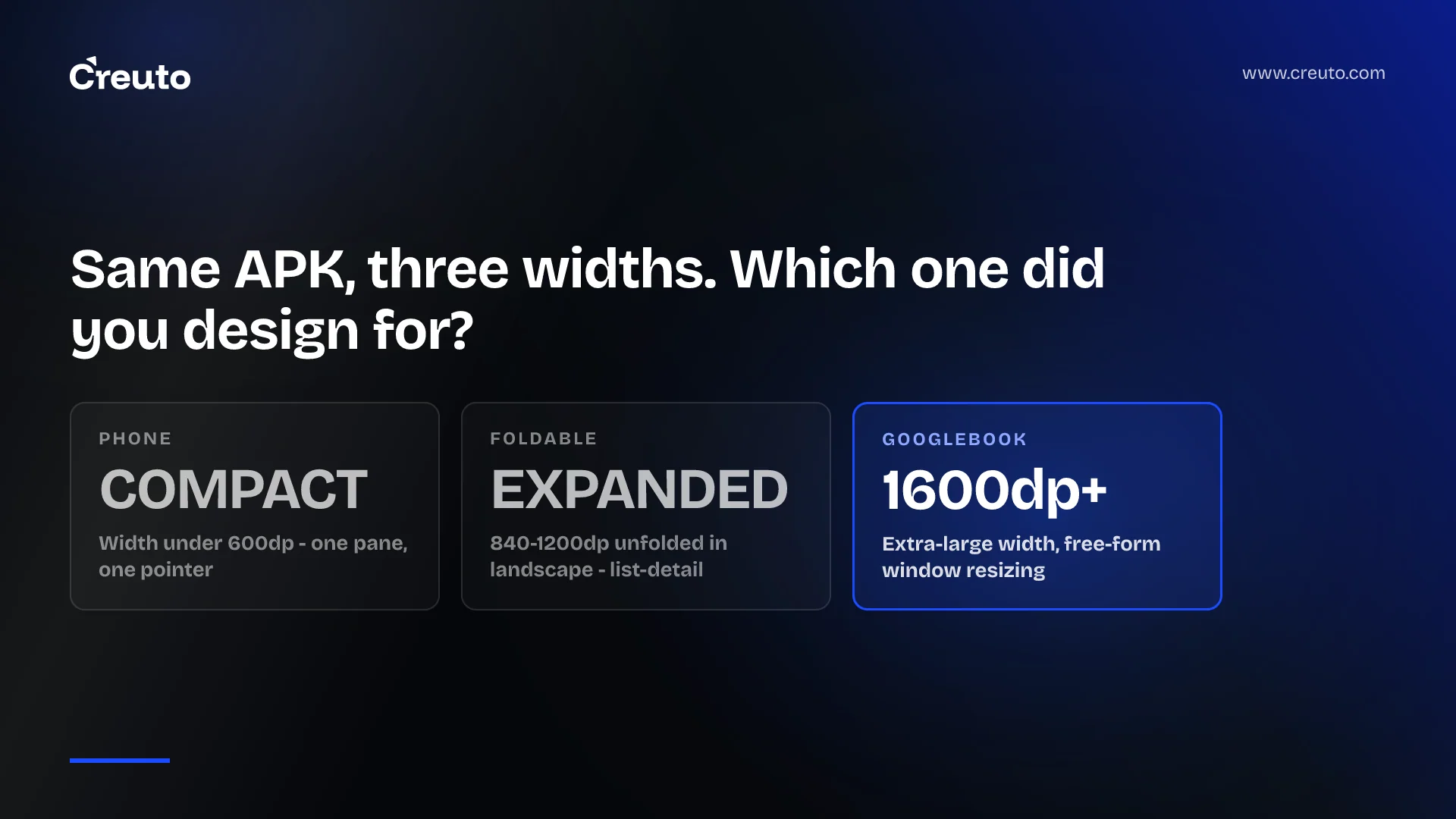
Googlebook is a new category of laptops built on a shared Android foundation, and your existing Android app will run on one. That is the trap. Running is not the same as being optimised, and from the developer blog onwards Google is tying Play badging, search placement and featured spots to the second thing, not the first.
Here is what “adaptive” concretely means in code — window size classes and their exact breakpoints, keyboard and pointer parity, multi-instance and drag-and-drop — how to test it before the hardware is on your desk, and exactly what Google Play says it gives you in return.
What Googlebook is, and what already runs on it
Google's announcement describes it plainly: Googlebook introduces a new category of laptops built on a shared Android foundation, with “high-performance hardware from partners such as HP, Dell, Lenovo, Acer, and Asus”. The devices pair touchscreens with a keyboard and a precision trackpad, and carry Gemini Intelligence at the OS level.
The developer hub is the page to read if you build Android: Google frames Googlebook as a large-screen canvas for your apps and lists the work as adapting layouts in Compose, supporting keyboard, mouse, trackpad, stylus and game controller, supporting multi-instance, enabling drag and drop between windows, designing for higher information density, supporting widgets, implementing custom cursors, and handling file and print management.
That list is the whole argument. None of it is a new API surface you have to learn from scratch; all of it is behaviour a phone-shaped app never had to have. An app built for one window, one pointer and one orientation will launch on a Googlebook and look like an app that launched on a Googlebook by accident.
What adaptive concretely requires
The single rule Google states is about what your layout reads. Your layout decisions should respond directly to the available window space using window size classes rather than the physical display dimensions. On a Googlebook, windows are resized freely, so the physical panel size tells you nothing about how much room your app has at any moment.
The breakpoints are published and specific. From Android's window size class reference:
| Width size class | Breakpoint | What it represents |
|---|---|---|
| Compact | width < 600dp | 99.96% of phones in portrait |
| Medium | 600dp ≤ width < 840dp | 93.73% of tablets in portrait; most large unfolded inner displays in portrait |
| Expanded | 840dp ≤ width < 1200dp | 97.22% of tablets in landscape; most large unfolded inner displays in landscape |
| Large | 1200dp ≤ width < 1600dp | Large tablet displays |
| Extra-large | width ≥ 1600dp | Desktop displays |
Height classes exist too — compact under 480dp, medium 480dp to 900dp, expanded 900dp and above — and most apps can ignore them. The exception matters on a laptop: a window that is medium in width but compact in height cannot carry a two-pane layout, and that is exactly the shape a half-height window takes.
Above compact width, the guidance is to stop scaling a single pane and switch to a canonical layout. The adaptive apps guide names list-detail, supporting pane and feed. In Navigation 3, the adaptive scene strategies do the work: ListDetailSceneStrategy and SupportingPaneSceneStrategy place panes side by side when there is room and collapse them when there is not. Grid and FlexBox primitives organise content within a pane, and Google flags experimental MediaQuery and Styles APIs for adjusting presentation on desktop displays.
If you are on React Native or Flutter rather than Compose, the breakpoints are still the contract, but the pane strategies are not given to you — which is one more entry on the list of things to weigh when you are comparing React Native against native in 2026.
Keyboard, trackpad and cursor stop being optional
Jetpack Compose supports keyboard navigation and pointer selection out of the box, so the baseline is free. The baseline is not what Play is badging.
Google's adaptive app quality guidelines sort desktop behaviour into three tiers — Tier 3 adaptive ready, Tier 2 adaptive optimised, Tier 1 adaptive differentiated — and the Tier 1 tests read like a list of the things phone apps never do. A scrollbar appears while scrolling with a mouse or trackpad (Scrollbar_Display). Hover produces previews, fly-outs and tooltips (Hover_Parity). Conventional shortcuts such as Ctrl-C and Ctrl-Z match the web and desktop versions of your product (Keyboard_Parity). Ctrl-click and Shift-click multi-select (Input_Combinations). Triple-click selects a whole line or paragraph (Triple_Click).
That last one is the useful signal. Nobody ships triple-click selection by accident, and nobody notices it is missing until they are on a laptop. The rest of the list follows the same pattern: contextual cursors that change to an I-beam or a resize handle, right-click context menus, a Keyboard Shortcuts Helper so the shortcuts are discoverable, and the large-screen input compatibility guidance behind it.
Multi-instance and drag and drop are the desktop tell
Two capabilities separate an app that tolerates a laptop from one that belongs on it. Multi-instance lets a user open independent windows of your app side by side to compare two things — two documents, two records, two orders. Cross-window drag and drop lets them move text, images and files between those windows, or drop content into your app to start a task.
Both are architectural, not cosmetic. Multi-instance breaks any assumption that your app has one activity stack, one in-memory cache or one “current” selection, and singleton state is where it fails first. Google's quality tests also expect drag and drop to work with touch, mouse, trackpad and stylus, in portrait and landscape, and in multi-window mode (T-Drag_Drop_Support), plus dragging multiple elements as a group (Drag_Drop_Batch). The Tier 1 list adds Request_Fullscreen_Mode, File_Picker integration, File_Handlers declarations and Printing_Support — document printing or PDF export — which most mobile codebases have never implemented.
How to test a Googlebook build before the hardware ships
There is a desktop emulator in Android Studio, available in the Canary preview channel, and it is the answer to the obvious objection that nobody on your team owns one of these laptops yet. Configure a virtual desktop environment and you can exercise the three things that actually break: free-form window resizing, multi-instance behaviour, and keyboard and pointer input.
Run the same checks we run on any large-screen port. Resize the window slowly across 600dp, 840dp and 1200dp and watch for layout thrash, lost scroll position and state that resets on recomposition. Open two instances and change the same record in both. Tab through every screen and confirm focus is visible at each stop. Drag a file in from outside the app. None of this needs hardware, and all of it fails in the first hour on a codebase that has only ever run on a phone.
Google also ships an AI-assisted adaptive skill through the Android CLI — published in the android/skills repository — that refactors mobile layouts into responsive Compose containers. Treat it as a first pass on mechanical work, not as the port. In the migrations we run, the layout refactor is rarely the hard part; the state model behind it is, and that is the same lesson that came out of Swiggy's hybrid-to-native rebuild.
What Google Play gives you for optimising
The incentives are stated plainly in the blog, and they are worth quoting rather than paraphrasing. Google Play highlights optimized titles with dedicated badging, enhanced search, and featured spots across curated store homepages. Beyond the store, “delivering this level of quality also prepares your app for the Apps Experience Program, where you can enroll to unlock a new program rate card designed to drive business growth”.
The distribution detail is the one to take to whoever signs off the work: “when users set up their new Googlebook using their Android phone, optimized apps are prominently highlighted for easy transfer”. Device setup is the single highest-intent install moment there is, and on a new category it is the moment a default gets chosen. This is a discovery argument, not a polish argument — the same category of argument as a Play target API level requirement, except that this one is an opportunity rather than a deadline.
Where this is not worth doing
Adaptive work is the wrong investment if your app is a single-purpose mobile flow that nobody would open on a laptop: a delivery rider app, a field data capture tool, a ticket scanner. Stretching a one-task screen across 1600dp of window earns nothing, and Tier 1 desktop behaviour on an app with three screens is effort spent to fail a test you were never going to be measured on.
It is worth doing if your product already has a web version people use at a desk, because then the comparison is not phone-versus-laptop but your Android app versus your own web app on the same screen — and the web app will win on keyboard, cursor and window behaviour until you close that gap. Content, productivity, reading, catalogue browsing, anything with a list and a detail view: those are the apps where the list-detail pane pays for itself on the first resize.
The practical next step is smaller than the announcement makes it sound. Install the Canary desktop emulator, run your app at extra-large width, and write down what breaks. That list is your scope, and it will be shorter than the quality guidelines — most of the cost sits in state and input, not pixels. If you want that assessment run against a real codebase, that is the kind of work our Android app development team starts with.
Frequently asked questions
Googlebook is a new category of laptops built on a shared Android foundation, announced by Google in September 2026, with hardware from partners including HP, Dell, Lenovo, Acer and Asus. The devices pair a touchscreen with a keyboard and trackpad and run Gemini Intelligence at the operating system level.
Existing Android apps run on Googlebook, but running and being optimised are different things. Google Play highlights optimised titles with dedicated badging, enhanced search and featured spots, and highlights them for transfer when someone sets up a Googlebook from an Android phone.
Adaptive development means your layout responds to the available window space using window size classes rather than the physical display dimensions. In practice that means canonical layouts such as list-detail and supporting pane, full keyboard and pointer support, multi-instance windows, and drag and drop between windows.
Android defines width classes as compact below 600dp, medium from 600dp to 840dp, expanded from 840dp to 1200dp, large from 1200dp to 1600dp, and extra-large at 1600dp and above. Height classes are compact below 480dp, medium to 900dp, and expanded above that.
Use the desktop emulator in the Android Studio Canary preview channel. It lets you configure a virtual desktop environment and exercise free-form window resizing, multi-instance behaviour and keyboard, mouse and trackpad input, which is where a phone-shaped codebase fails first.
Google Play highlights optimised titles with dedicated badging, enhanced search and featured spots across curated store homepages. Reaching that quality level also prepares an app for the Apps Experience Program and its program rate card, and optimised apps are prominently highlighted during Googlebook setup.